Creating a peaceful and relaxing atmosphere in your home starts with the colors you choose for your walls, furniture, and décor. Calm colors can transform any space into a comforting retreat, helping reduce stress and promote a sense of well-being. If you’re considering refreshing your home’s look or starting a new design project, this guide will help you select colors that bring calm and balance to your living spaces.
Why Choose Calm Colors?
Calm colors are typically soft, muted tones that evoke tranquility. They help create environments where you can unwind, focus, or enjoy quiet moments. Many people find calm colors encourage relaxation and reduce feelings of anxiety, making them perfect for bedrooms, living rooms, and even home offices.
Choosing the right calm colors is more than picking your favorite pastels. Understanding color psychology, the lighting in your room, and the overall mood you want to create will guide you to selections that feel just right.
Popular Calm Color Families
Before diving into tips, here’s a quick overview of some commonly used calm color families:
– Blues: Known for their soothing and cooling effect, blues are perfect for creating serene spaces.
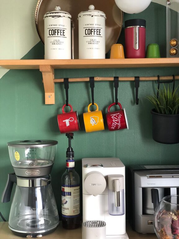
– Greens: Often associated with nature, greens bring a fresh, restful feel.
– Neutrals: Soft beige, cream, taupe, and gray create understated elegance and balance.
– Lavender and Soft Purples: These hues add a gentle, restful vibe without overwhelming the senses.
– Muted Pinks and Peaches: Warm and inviting, these colors add a subtle touch of softness.
How to Choose Calm Colors for Your Home
1. Consider the Room’s Purpose
Think about how you use each room. For bedrooms, calming shades like soft blues or muted greens can help you relax and sleep better. Living rooms might benefit from neutral tones that provide versatility and warmth, allowing you to add colorful accents if desired. For spaces where focus is key, such as a study or office, consider calm colors that promote concentration without feeling too cold, like gentle greens or light grays.
2. Assess Natural and Artificial Lighting
Lighting plays a big role in how paint colors appear. Natural light can make colors look brighter or cooler, while artificial lighting (warm or cool bulbs) can shift their tone.
– Bright natural light: Colors may appear lighter and more vibrant.
– Limited natural light: Choose slightly brighter shades to avoid a gloomy feel.
– Warm artificial light: Can make cool colors like blue appear cozier.
– Cool artificial light: Can enhance the crispness of colors like gray or green.
Test paint samples on your walls and observe them at different times of the day before making a final choice.
3. Use Color Samples and Swatches
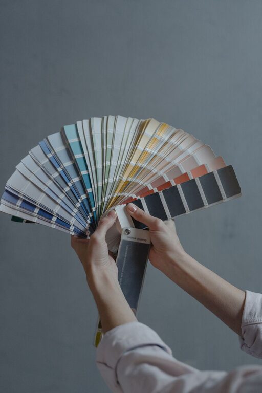
Don’t rely solely on paint chips at the store. Buy small sample pots and paint test areas on your walls. Observe how these colors look in your space during various lighting conditions. This hands-on approach will help you avoid surprises.
4. Combine Calm Colors With Texture and Accents
The color palette doesn’t have to carry all the weight. Use textures like soft fabrics, natural wood, or woven materials to complement calm colors. Accent with subtle patterns or metallic finishes (like brushed gold or matte silver) for added interest without disrupting the tranquility.
5. Stick With Matte or Satin Finishes
Glossy paints can feel too sharp or reflective for calm spaces. Matte or satin finishes are better at diffusing light softly and enhancing a cozy ambiance.
6. Keep Color Contrast Low for a Relaxed Look
Sharp contrasts and bold colors demand attention and can make a room feel more energetic. For a calm effect, select colors with similar undertones and gentle contrast. For example, pairing a pale green with a soft beige rather than bright white will feel more soothing.
7. Balance Warm and Cool Tones
Both warm and cool colors can be calming, but balance is key. Too many cool tones like blues and grays might feel chilly, while too many warm tones like peach or beige can feel heavy. Mixing both in subtle ways—for example, a cool blue wall with warm wood furniture—creates harmony.
Best Calm Color Combinations to Explore
Here are some popular pairs and palettes you might consider:
– Soft Blue + White + Light Wood: Classic and airy for bedrooms or bathrooms.
– Sage Green + Cream + Natural Fibers: Earthy, inviting, and perfect for living spaces.
– Lavender + Soft Gray + Silver Accents: Elegant and restful, great for bedrooms.
– Pale Peach + Beige + Light Brass: Warm and nurturing for cozy areas.
– Muted Aqua + Light Taupe + Linen Textures: Fresh yet understated, ideal for kitchens or dining rooms.
Additional Tips for a Calmer Home Environment
– Keep it minimal: Avoid overcrowding rooms with too much furniture or décor to maintain a peaceful feel.
– Incorporate plants: Greenery naturally enhances calmness and adds life to soft color schemes.
– Use window treatments wisely: Sheer curtains can soften light and complement calm colors.
– Create zones: Use calm colors to define areas within larger rooms for relaxation or work without visual chaos.
Conclusion
Choosing calm colors for your home doesn’t have to be complicated. By considering the purpose of your rooms, lighting, finishes, and color combinations, you can create beautiful spaces that soothe your mind and body. Remember, the goal is to build an environment where you feel comfortable and at ease.
Start by selecting a few samples and testing them out—you may be surprised how simple choices can dramatically improve your home’s atmosphere. Happy decorating!